From scan to production-ready files for digital printing
I turn scans of textures and materials into production-ready files for wallpaper, flooring, panels, and other large-format printed surfaces.
Each project is different. Some clients need one specific step, such as scan correction or seamless repeats, while others need support across the full development process.
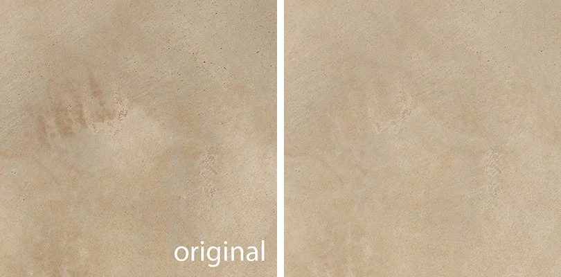
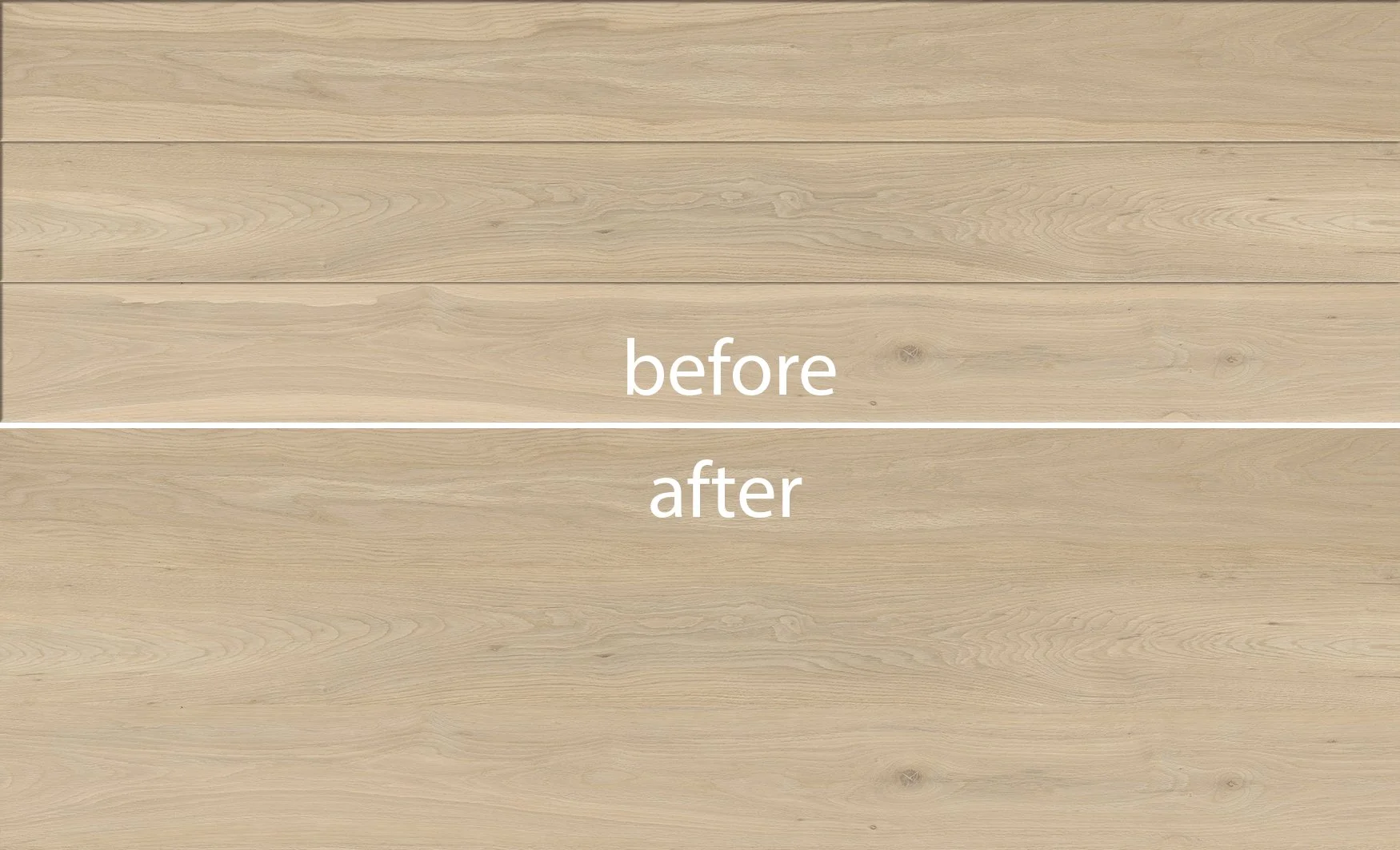
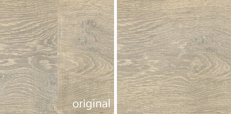
SCAN CORRECTIONS
Before a design can be repeated, recolored, or placed into layout, the source image needs to be clean, balanced, and technically reliable.
I correct imperfections in scans such as spots, dust particles, scratches, color deviations, distracting details, and other imperfections that could affect the final print result.
Removing, adjusting, or adding elements where needed
Enhancing texture while preserving a natural look
Adjusting contrast, color, and fine details to avoid unwanted spots in production
Each correction is made with technical precision, so the design keeps its realism while becoming production-ready.
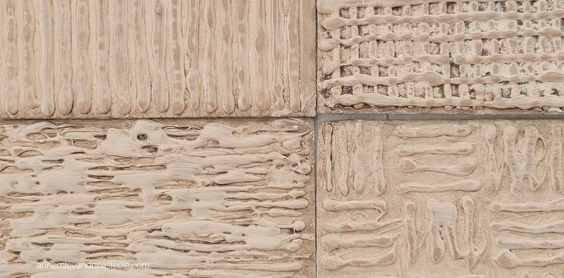
PRODUCTION LAYOUTS
Creating strong production layouts with visual balance and technical accuracy on large surfaces.
I develop production layouts up to 8m², combining separate planks, tiles, or individual elements into one cohesive design with a natural flow and realistic appearance.
Combining separate elements into one balanced layout
Rearranging parts to create a natural visual flow
Reducing repetition and distracting transitions
Mirroring, rotating, or refining areas to improve balance
Correcting color spots and uneven details for a cleaner print result
The result is a structured, realistic layout that feels visually natural and ready for production.
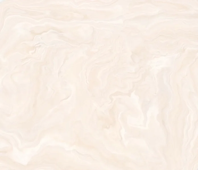
SEAMLESS REPEATS
A seamless design prints flawlessly at any scale, without visible transitions or repeat lines that interrupt the flow of the surface.
I create seamless repeats that allow a design to continue naturally across the full surface, whether the repeat needs to run in all directions or only in width or length, depending on production requirements.
Removing joins between elements to create a fully seamless layout
Building repeats that can print endlessly in the required direction
Replacing or refining distracting details that break the repeat flow
Correcting color transitions so the repeat disappears naturally
Adjusting color spots and tonal variations to avoid distractions in print
The result is a natural-looking surface where the repeat becomes invisible — technically precise and visually balanced.
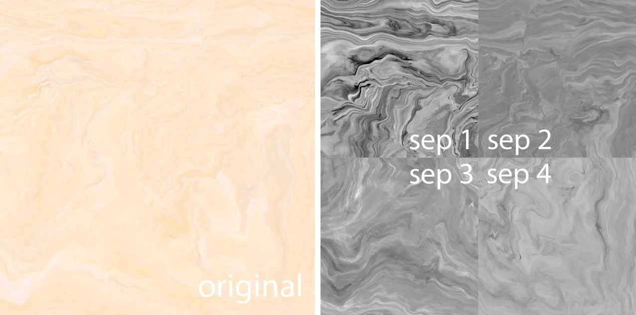
COLOR SEPARATIONS
Color separations prepare the artwork for accurate printing, color matching, and reliable reproduction.
Well-prepared separations make it easier to develop colorways, reduce production corrections, and ensure that the original material can be reproduced consistently on the final printed surface.
Accurate color matching
Easier recoloring for multiple variations and scalable collections
Fast, efficient adjustments of tones and contrast
More consistent results across different materials, printers, or factories
Digital color studies before production begins
The goal is always the same: reproducing the realistic color of the master sample while maintaining control, flexibility, and predictable print results.

COLOR VARIANTS
Color variants allow one master design to grow into a complete collection without rebuilding the artwork from scratch. Designs can be adapted quickly to different interiors, materials, or collection needs while maintaining a consistent visual identity.
I create balanced, production-ready color variants by adjusting tones, contrast, and color balance while preserving the realism of the original design.
Multiple colorways from one master design
Flexible adaptation to trends, collections, or product ranges
Consistent visual identity across different materials or surfaces
Reliable, production-ready files for each variant
The goal is to give you creative flexibility while maintaining technical control and predictable print results.
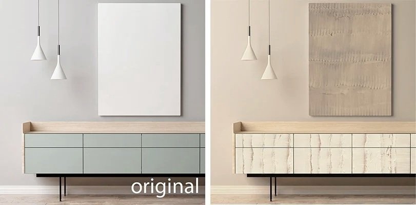
MOCK-UPS & 2D VISUALS
See how your design will look on the final product before production begins.
I create realistic mock-ups and 2D visuals to show how a design works within an interior, helping you evaluate scale, visual impact, and overall atmosphere long before physical samples are available.
They help you to:
Test scale, layout, and pattern flow in a real interior context
Evaluate color combinations and compare variants quickly
Present concepts for marketing, sales, or internal development
Communicate ideas and launch collections before physical samples are produced
A practical tool that supports confident decisions and creates a clear bridge between concept, development, and presentation.